Client: SeaWorld
Goal: I worked on several projects for this client when I was asked to come up with a logo for their official pin trading program launch. They wanted a classic-looking logo that would be easily identifiable to their guests.
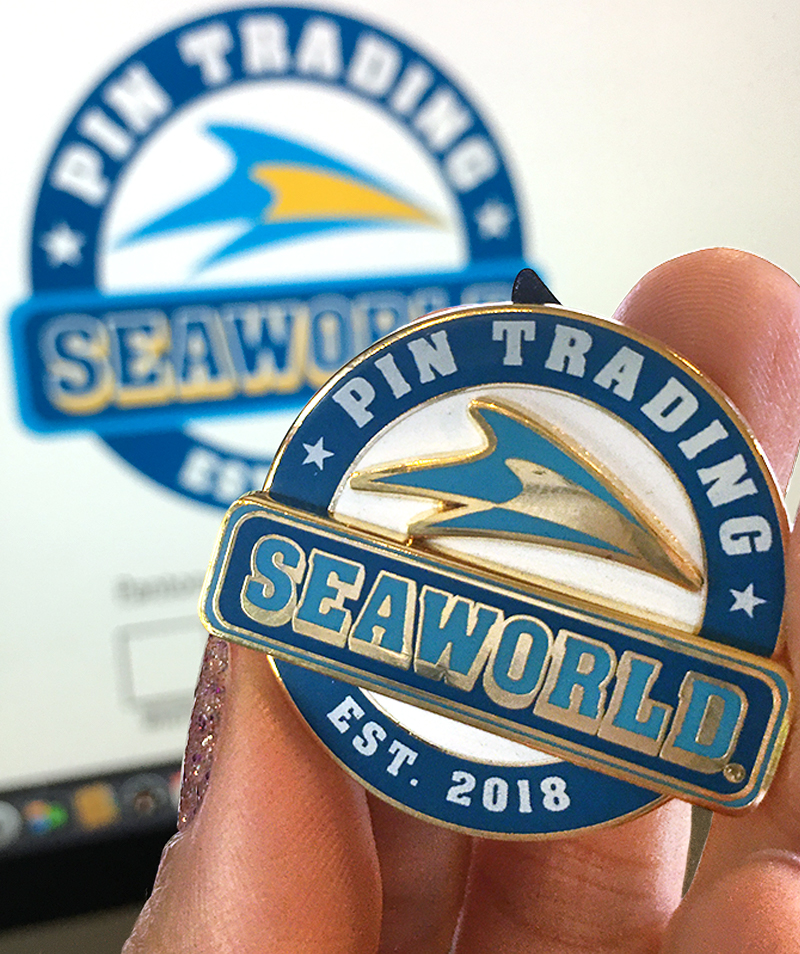
Design Process: I chose to use a circle and banner arrangement, with the logo and name drop as the focal point. Colors were taken from the existing logo. The end result is a simple, yet bold and easily identifiable badge that SeaWorld guests would be able to spot quickly from a distance. We expanded on this branding for their starter set packaging.
Outcome: The logo was also used in signage around the parks, which I got to see personally during a visit in the summer. As an added bonus, I also got to design the pin trading logo for their sister company, Busch Gardens®, as well!

Leave a comment